ShopDreamUp AI ArtDreamUp
Deviation Actions


Suggested Collections


You Might Like…


Featured in Groups


Description
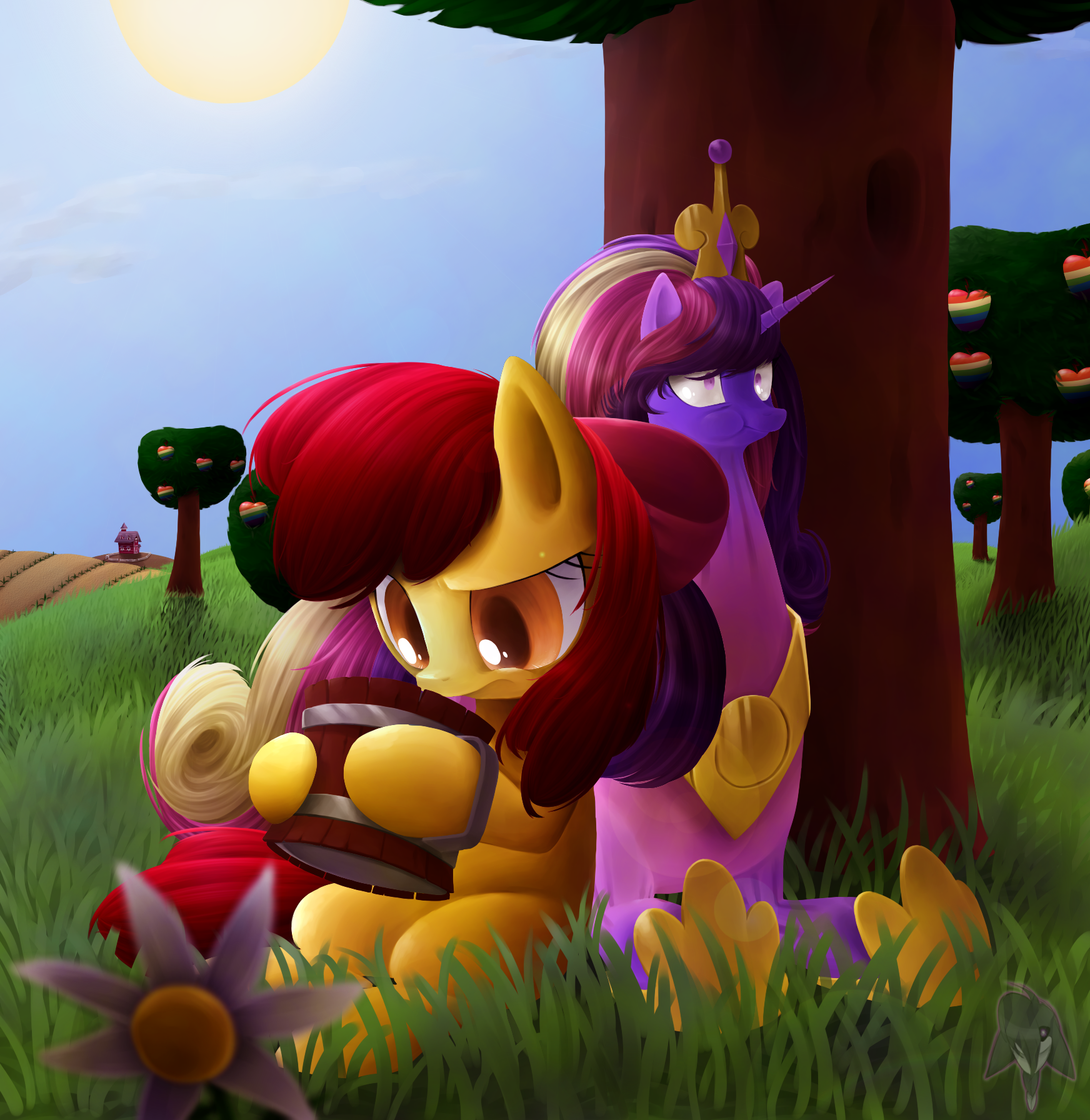
Requested by CyberFox [link]
So it's zap apple season, Applebloom tries her hand at making zap apple cider, and by looking at Cadence's face, you can see the end result")
It took me absurdly long to finish this, but you know, distractions, they happen.
So it's zap apple season, Applebloom tries her hand at making zap apple cider, and by looking at Cadence's face, you can see the end result
It took me absurdly long to finish this, but you know, distractions, they happen.
Image size
1744x1792px 2.36 MB
© 2012 - 2024 RouletteObsidian
Comments70
Join the community to add your comment. Already a deviant? Log In
This is such an interesting piece to look at, I'm not sure where to begin! I suppose I'll start with all the positives of this lovely and humorous piece.
I really admire your dedication to detail. The strands of hair, the grass, the shading; it's all very lovely. I can tell you really put effort into this. The flower in the forefront is out of focus, and I think that adds a great perspective to the entire composition. The lighting is great, and well thought-out. Your characters have a great stylization, especially Applebloom. The expression on her face is wonderfully done, and the eyes are beautifully painted. The cider cup in her hooves is a nice, even cylinder, and curves stylistically inwards and frays out again near the edges.
Now for the areas in which I believe you can improve. Your anatomy is great, though, for such a realistic style, Cadence's head seems a bit too morphed. It seems as though a more cartoonish style would be appropriate for such a situation. Your lighting is great, though the part of Cadence where Applebloom is leaning should be cast in shadow. How it looks currently is as if Applebloom weren't there; her body would most definitely cast a shadow against Cadence's right side. The background is lovely in terms of detail, but your tree anatomy is a bit stiff. All of your trees are straight up and down, void of any bumps or curves that occur naturally in tree trunks. Your bushel of leaves atop the trees also seem a bit flat. Not quite sure what you were trying to achieve there, but it looks more rushed than the initial focus of the piece: Applebloom and Cadence. The zapapples also seem to be a bit out of proportion. They are larger than they should appear for the distance you've placed your trees. Despite zapapples being large in general, I feel as though they could stand to be a bit smaller when putting your trees into perspective. The last thing that I might point out, would be the lens flare. While it may seem like a tiny detail that may be overlooked, I believe the flare should line up with your sun. It seems to appear the slightest bit crooked, though that may just be me.
Overall this is a lovely piece with a beautiful composition, and obviously lots of time and effort went into this. What a lucky person to be receiving such a request for free! I wish you luck in your future artistic endeavors.